QR Code Buried On Outdoor Signage
QR codes are not afraid of heights. Despite this, they still tend to be placed in obscure places, and in this place, mere inches from the ground.
The following sign was up for the month of September last year in Chicago’s Millennium Park.
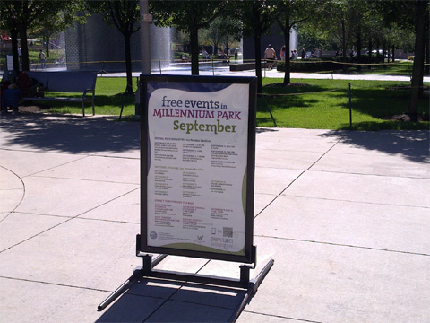
From a distance, you can barely see the QR code at the bottom right of the sign. I saw it, but I digress. Here’s a closer shot of the sign.
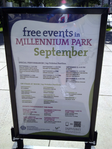
I was able to get a closer shot, but I had to squat down to take the picture.
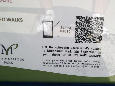
The code did work at the time, but it brings up an error, now several months later.
Where it’s always nice to see a QR code in action, why implement one so poorly? The position so low to the ground makes it less likely to see, let alone scan. If you do scan it, you’d have to squat down or have to bend over in an awkward position. The description accompanying the code could be made much clearer and concise. I also encountered issues scanning the code as the protective clear plastic over the poster caused a reflection and didn’t allow me to quickly scan the code.
How could this have been improved? By simply moving it from the bottom right to the top right would have helped adoption. This would have positioned it at just above waist level, that is for someone like myself just under 6 feet. Making the accompanying text clearer may have helped as well, or simply having it say, “scan here or visit explorechicago.org” would have been all that was needed.
So, would you have even bothered to have scanned a code in such a location? Share that or any other thoughts in the comments of this post.
Did you enjoy this? Subscribe to The Hot Iron by RSS/XML feed or Read by Email.
This is from The Hot Iron, a journal on business and technology by Mike Maddaloni, Founder and President of Web consulting firm Dunkirk Systems, LLC.
Build • Mobile Technology • QR Codes • QR Codes In Action • (1) Comments • Permalink
Time Magazine Artistic QR Codes
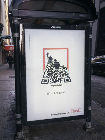 Can QR codes be artistic? Of course, and if you need examples right away check out the QR Arts site. When large corporations use QR codes, many notice. When major corporations do something artistic with QR codes (or anything artistic for that matter) people notice even more. That is, if you recognize it is an artistic QR code.
The accompanying photo is of a bus kiosk ad in Chicago for Time magazine. The familiar red border of Time is clearly visible. It looks like soldiers are walking in a swamp, but they are actually walking in a QR code! The code itself is rotated 180 degrees so all 3 large corner squares are visible, which is a very valid use for them. It is also angled back. Both of these are why I question if to the casual person walking by, will they realize it is a QR code? Upon scanning the QR code, you are taken to a page on Time’s Web site on the topic of war.
What do you think – upon first glance would you think this is a QR code? Your thoughts are welcome in the comments for this post.
Did you enjoy reading this? You are welcome to subscribe to The Hot Iron by RSS feed or by email.
QR Code In Name.com Email Links To Android App Download
In the past I have said QR codes are a way of tying the offline and online worlds. After seeing the use of a QR code I am writing about today, I am changing that statement to this: QR codes are a nexus between mediums.
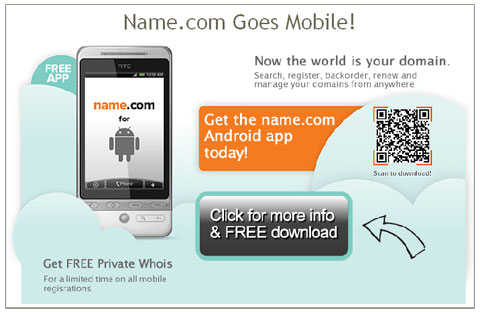
Name.com is a great domain name registrar I use personally and for my business (note the link is an affiliate link). They have a clean and intuitive user interface that does not bombard you with upselling options at every click! They also provide outstanding and efficient human support whenever I need it. As part of that service, Name.com have recently launched an app for Android mobile devices, allowing you not only to register new domain names, but backorder domains as well as manage your entire account. They announced this with an email message as pictured below.
In it, there is a QR code. It links to a page on their Web site for the app. The email message is consistent in design with the Web page. The options they include on this Web page, including the ability to download it by SMS (texting to us in the US) and email, as well as a QR code taking you directly to the Android Market.
In this case, the QR code was a bridge between digital mediums – email and the Web. Of course if I read this email on my mobile device I wouldn’t be able to scan it, but as I opened it from within my Thunderbird email client, it worked. An argument can be made whether to link directly to the Android Market from the email rather to a landing page which then links to the Market. This is a great scenario for performing A/B or split testing on the email message, which they may have done anyway. Overall I believe this email from Name.com does a decent job of communicating the value behind the QR code.
What do you think of this QR code use? Would you link directly to the Android Market? Have you or would you use a QR code in an email message? You are welcome to share your thoughts and opinions in the comments of this post.
Did you enjoy reading this? You are welcome to subscribe to The Hot Iron by RSS feed or by email.
Kellogg’s New Crunchy Nut Cereal Uses QR Code To Reinforce Marketing
A visit to the cereal aisle of a US supermarket is always an overwhelming experience, as with each visit it appears that there’s even more choices to make. In this crowded field of breakfast foods, you need to stand out somehow, and why not with a QR code?
A new variety of cereal, Crunchy Nut from Kellogg’s, featured a QR code on the back of its cereal box as shown below:
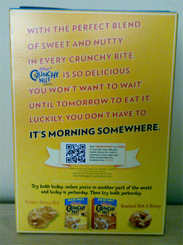
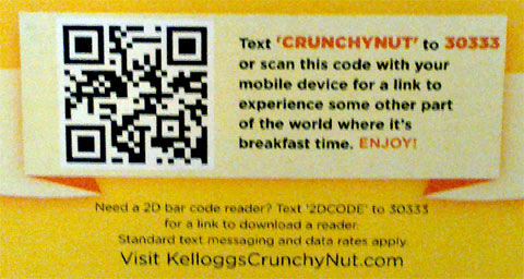
Note there was not a QR code on the front of the box, and I discovered this when I went to buy the cereal. The detail of the QR code is shown below:
Upon scanning the code, you are taken to a mobile Web optimized site where it shows a video reinforcing its marketing message about eating the cereal day or night because “it’s morning somewhere.” I have visited the site a few times and I observed different videos.
This a good example of a presentation of a QR code as well as what it links to. In a prominent location, the message offers both the option to send an SMS message or to scan the code, and below it tells the cereal eater how they can get a reader app, and if they do so, they may be charged for it. In this case, Kellogg’s chose to call it a 2D bar code, and my guess all of this text was vetted by their legal department and thus it is called as such, as technically QR code is a trademarked name, but offered as an open standard.
Only if the cereal lived up to the quality of the QR code presentation – it was a little bland for my taste, and not that crunchy either, but I digress. The QR code won me over in this case.
Did you enjoy reading this? You are welcome to subscribe to The Hot Iron by RSS feed or by email.
Surrounded By QR Codes In A Chicago Transit Car
Where last time I talked about QR codes on a Chicago transit station platform this time I am stepping into the car, where I am surrounded by a single ad campaign and large QR codes, as you can see in the photo below.
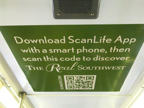
The photo shows an ad for The Real Southwest, which is being sponsored by the Tucson, Arizona Convention and Visitors Bureau. All of the ad spaces in this train car are for the same campaign, which is becoming more and more common place. What is interesting about the photo above is that it is of the ad affixed to the ceiling of the train car! The photo below shows a similar ad, but at eye level, and with a one word difference – can you find it?
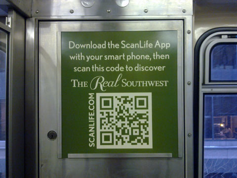
The actual train car I was riding on was full so I was not able to get other pictures without annoying other passengers any more than I was when I took these. Not every ad had a QR code on it, but there was always within a standard field of vision.
Instructions Built-In
What’s unique about this ad series is that the instructions are prominent within the ad copy. Many times if there are instructions along with a QR code on what to do with it, they are in small type and located in the corner of the ad. It tells you to get the Scanlife, not to download a QR code reader, which is also unique. And by placing the URL to scanlife.com alongside the code is, again, unique. Of course if you know what a QR code is you will just scan it.
All of the codes I scanned took me to the same web page on the Tucson Web site. What would have been interesting was if they had different QR codes, thereby being able to track which one people scanned to get to the Web site, or having a unique QR code on the ceiling to track how many people look (and scan) up.
What are your thoughts on this ad – is it as unique as I have said it is, or just a good campaign? Please share your thoughts in the comments of this post.
Did you enjoy reading this? You are welcome to subscribe to The Hot Iron by RSS feed or by email.


