On Sunday, February 13, 2011 the Grammy Awards will be held and broadcast on the CBS network in the US. To promote this, there are ads displayed on the “L” train platforms in Chicago, also known as the Chicago Transit Authority or CTA. Below is a photo of how 3 ad panels are displayed together.

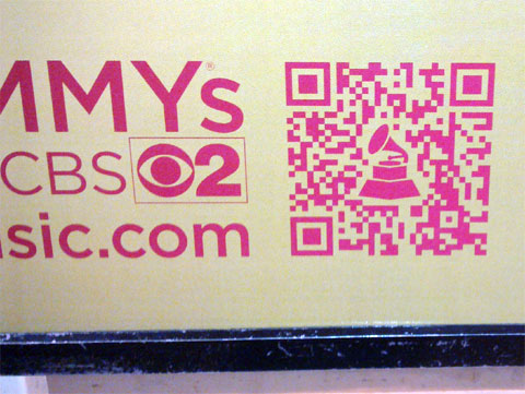
On each panel there is a QR code. When scanned, it goes to a Web site called MusicIsLifeIsMusic.com, specifically to a page for the artist appearing on the particular ad panel. Below is a detailed photo of a QR code for an ad for Katy Perry.

Note I took the second photo before the first one – I first saw the ad panels which featured the second photo at a very narrow point on the platform and was only able to get the detail, where I was able to get a wider shot of 3 panels together, interestingly at the same station and in the 3 panel photo, there is not one of Katy Perry.
There’s a few unique aspects to these ads and how they use QR codes. As each panel has a different QR code, it can be determined which of the 3 was scanned. This can tell one of 2 things – either the person scanning has a preference to the particular artist, or they chose that QR code at random or because it was easier to scan. Also note the Grammy Award trophy in the QR code. As QR codes have built-in redundancy and can have degradation up to 30%, some part of the code can be replaced with another image. There is no magic to this – you have to make the change and test the heck out of it to make it effective.
These particular ads are positioned low to the ground. As a result, you need to bend down to scan, which may cause some not to do so, especially at the narrow part of the train platform where I was. Many times I see QR codes towards the bottom of an ad, which is unfortunate, as QR codes are not afraid of heights!
What do you think of this use of QR codes? Please share your thoughts in the comments of this post.
Did you enjoy reading this? You are welcome to subscribe to The Hot Iron by RSS feed or by email.
Mobile Technology •
QR Codes •
QR Codes In Action •
Strategize •
Technology •
(2)
Comments •
Permalink
Comments
The QR code placement on the bottom is an interesting observation.
QR codes are still very much being treated as footnotes rather then serious value adds. I wonder what the best ratio of the instant visual ROI of an big graphic vs. the powerful ROI of a RIA/ msite?
Patrick Donnelly, QrArts LLC
http://www.qrarts.com

Comment by
Patrick Donnelly
on 02/09/11 at 12:04 PM
@Patrick - My thoughts exactly, as space for a QR code must be taken into consideration, but it shouldn’t be placed so it may not be effective.
I unfortunately have an even worse example for a future post, but just saw an ad on a bus kiosk in Chicago today (from my car, so I didn’t get it close) which has the QR code at eye-level.
mp/m

Comment by
Mike Maddaloni
on 02/09/11 at 12:12 PM
Post a Comment
Note: Comment moderation is active, and your comment will be viewable once it is reviewed.


