On the iPad and Iterative Design and Web Sites
 As several people have asked me about my opinion about the iPad, I figured what better way to answer them than on The Hot Iron? While collecting my thoughts on it, what I am presenting goes beyond the device itself, but is related to how and why it is here.
Before I start, let me say I own an original iPod Shuffle and an iPod Nano. I don’t own a Mac or an iPhone, the former as I am content with my Windows PC and the latter is due to it being a locked device to the shaky and overpriced AT&T network. I will also say to satisfy the FCC hawks that I have no direct connection or direct financial stake in Apple. Working in tech my entire career, I also understand a little on how Steve Jobs thinks, and my opinion will come out as you read this.
On The iPad Itself
When I saw the announcement of the iPad, I admit I was not blown away by it, but I was also not repulsed by it. It seemed to me a larger version of the iPhone, allowing for full Web browsing and book reading, which is not an unfair description.
Here’s what I said to PSFK’s Purple List, which was posted on their blog the other day:
“In the short term, Apple fans and early adopters will gravitate to the iPad, though many I have talked and my own belief is that people prefer the portability of the iPhones. In the long-term the impact of the iPad will be in the advancement of other hardware manufacturers’ own foray into tablet devices.”
It’s a nice device but not for me. It will have its market but I don’t think it will take off in its current version as some may think. And this is about all I have to say about the iPad.
On Iterative Design
You’re probably wondering that is all I, Mike Maddaloni, has to say? Actually, that’s it, for I feel this first version of iPad is really about getting out there and seeing how it is received in the marketplace. I can somewhat speak from experience as the Shuffle and Nano in my home are only a few years old and far different from the current models. Apple is a product company and they need to sell units. What better way to do so than under the moniker of innovation?
What Apple has done is put out an initial, well-styled and designed product. They will next put out another initial, well-styled and designed product with iterations in its features, but not quite perfect. Where critics will pick apart each new version, it will certainly draw customers, and as a result sell more products. Granted Apple is not the only company who does this, but among all of the style and black clothing, Apple is a business. This in itself is a topic which could be debated on and on and on.
On Web Sites
Rumors are swirling as to why the iPad’s browser will not support Flash. Today, Flash is the main way people view video content on the Web. It has not always been that way, and it won’t necessarily always be that way. Talk of how the next version of the HTML Web programming language supporting video will address this issue has been one answer, but asking any programmer you will find few thinking about HTML 5.
My rumor to add to the mix is AT&T couldn’t possibly handle the network traffic of full-screen, high-definition video. As Apple continues to be tied to AT&T, this is a sacrifice anyone who owns an iAnything will have to deal with.
I don’t see this as much of an issue for those who build Web sites. In general, you should accommodate for those who don’t want to see Flash or don’t have its browser plugin. Sure, all Flash Web sites are still popular, but it’s nothing I recommend to my clients at Dunkirk Systems, LLC, and here’s a prime example of why. I doubt the iPad will push new ways to view video on the Web. Apple has its own Safari browser and QuickTime video format, and these could be a contributing factor as well.
In other words, I am not losing sleep over the launch of the iPad, nor is it making me sleep easier. I am more curious to see, as I was quoted, what the competition comes out with as a result of this high-profile device.
Did you enjoy reading this? You are welcome to subscribe to The Hot Iron by RSS feed or by email.
High-Tech Delivery Can Overshadow Message
Marshall McLuhan is famous for the quote, “the medium is the message.” My short definition of the meaning of this quote is that it isn’t necessarily what is being said, but how it is said. I thought of McLuhan on a recent ride on Chicago’s Red Line subway, where I saw the following notice.

The notice reads of upcoming route cuts on Chicago’s CTA system. What it doesn’t say is why, and not saying it is not at issue as it has been widely reported in the media and blogs around the Windy City of the CTA’s budget “issues” and the need to cut service to balance its budget.
As I read this notice, the words were not as important as what I was looking at. The notice is displayed on an HDTV encased in a protective kiosk to ideally prevent it from damage and vandalism. The cost of such a display unit was adding up in my head along with other budget numbers I have read in the previously-mentioned stories. In the end I did not see a notice of services changes, rather an expensive display device.
The irony in this thinking is it came from me, a career high-tech professional and Web consultant. I have discussed such display units with clients. However this is not the only example of using technology that in the end has bothered me. A few weeks back I received an onslaught of phone calls for the eventual winner of the Massachusetts U.S. Senate race, Scott Brown, on my Chicago 312 area-coded business line! Somehow my number was derived from some computer-processed algorithm which followed me, who used to live in the Bay State, to the Land of Lincoln. Months prior to this I received letters form now-defunct GM brand Saturn to my Chicago home thanking me for my loyalty to them. I bought a Saturn in 2003 and dumped it in 2000 (with emphasis on the word "dumped"), yet they were still able to find me.
All in all, no message will resonate with everyone it is presented to. But as we progress into more tech-driven message delivery, we should be cognizant of the sincerity of this message, which can be compromised using modern, inexpensive means. Surely a hand-written note from the CTA, Scott Brown or Saturn would have been perceived by me to be the same as the automated message. Before pressing the send button or making that buying decision, think about if you have to justify the medium as well as the message.
Did you enjoy reading this? You are welcome to subscribe to The Hot Iron by RSS feed or by email.
Selling The Web Design Business Kit from SitePoint on eBay
It has served me well, and now it’s time for it to be in the hands of a start-up Web design and development business. I am talking about The Web Design Business Kit from SitePoint, which I have just posted for sale by auction on eBay. Below is a photo of the 2 binders and CD-ROM which make up the Kit.
The Kit consists of processes and procedures for owning and operating a Web design and development business. It is a step-by-step process that takes you through the business process of building a Web site and is supported by documentation and files in Excel and Word you can use right away in your business. Note the files are in Australian MS format but can easily adapted to US format. I purchased the Kit brand new a few years ago and learned quite a bit from it. The version 2.0 of this sells for almost $250.00. The content in the Kit is timeless.
Did you enjoy reading this? You are welcome to subscribe to The Hot Iron by RSS feed or by email.
Think Of Your Logo In Other Formats
 As businesses start-up today, they often think of a logo to aid in their branding. Most companies in 2010 are not publishing paper-based materials, thus they usually only think of their logo to be used on their Web site, or secondarily on a business card. And that’s it. However, even though you may only initially intend on using it in certain ways, taking into consideration all possible uses for a logo up-front can save time and hassle in the future should other needs arise.
Here’s a few logo uses you should consider.
Black and White - As most people don’t choose a bland and white logo, it most likely be will be represented in some form in black and white. From photo copies to simply saving money on color ink to print in black and white, take into consideration shades of gray when your logo is designed.
Fax - When you fax a document, shades of gray disappear. Having your logo designed to look good on a faxed piece of paper. Test it if you're not completely certain.
Embroidered - When a logo is embroidered onto clothing or other fabric items, sometimes compromises must be made. The intricate details of some logos may not be able to be stitched in the same detail. Also, there may be additional charges for each color of thread that may make your golf shirt prices much higher than expected.
Full-Color Printing - In this world of digital everything, offset printing is still alive and well. Where printing in full-color should be easily be able to accurately represent your logo, it may cost you more for additional colors or colors which require special colors outside of the normal color palate.
Icon - If you want to use your logo as an icon, there are various formats to consider. The favicon which appears in a browser’s address bar is only 16 by 16 pixels. The icon on a mobile device like the iPhone is larger, but still small in comparison to how large it may be on your Web site. As well for mobile apps, you want to ensure the icon itself is compelling so uses will identify with it and use it.
Where you may not be able to anticipate every use of your logo, by knowing ahead of time the most common ones, you should be in good shape to leverage it across all formats.
Did you enjoy reading this? You are welcome to subscribe to The Hot Iron by RSS feed or by email.
When Navigation Is Not Necessary
The term navigation relates to getting from one place to another. With roots in sailing, it has been applied in other means of travel – like in driving – as well as other means of finding something – like in Web sites. The navigation of a Web site or computer application can mean both the links that guide a user to get to different areas of a Web site or the process of using such navigation.
Over time, navigation has gotten more and more complicated as features and functionality is added. Sometimes we feel like we should be donning a ship captain’s uniform to find what we want to do! There are ways around this. Providing a search function can allow a user to bypass traditional Web or application navigation to get directly to the content. Placing the most commonly used functions up-front is another way to get people quickly to what they want. By knowing your users and what they want most often, you can make such improvements to get people in and out of your computers quickly.
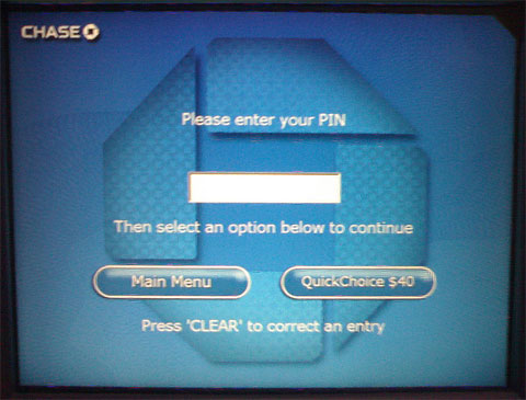
Then there is the option of removing navigation altogether of a user wants to use a key function. A great example of this is what I now use quite often with Chase Bank ATMs. As you can see from the picture of the PIN entry screen of the ATM, you can choose to login and go to the main menu, or bypass it altogether and withdraw a preset amount of case from the ATM. Where the process of a “fast cash” option is nothing new (I recall using it at BayBank back in the 80’s), here a second button allows you to login, get the amount you set previously (and is conveniently displayed for you) and get out. All this, without seeing any menus.

More than likely Chase looked at how people use their ATMs and made this determination. In Web sites or application, look at the usage analytics and determine the most-used features. If you’re not tracking analytics, do it now! Your applications can tell you more about what people want to know about you or buy from you, they can tell you about the people who are doing so.
Did you enjoy reading this? You are welcome to subscribe to The Hot Iron by RSS feed or by email.


