Mike Maddaloni Interviewed On Open Source for Web Central Station
 Recently I was interviewed by CT Moore for the Web site Web Central Station on the topic of open source development and interoperability. As I have worked with both open source and commercial software and development tools over my career, I welcomed the opportunity to share my perspective with their readers.
You can read the article here on the Web Central Station Web site, which is a Canadian Web site sponsored by Microsoft. In short, as I have always said to my consulting clients at Dunkirk Systems, LLC, it is about the right tools or technology for the project.
What do you think? Do you agree or disagree with me? I welcome your comments, either here on The Hot Iron or at Web Central Station.
Did you enjoy this? Subscribe to The Hot Iron by RSS/XML feed or Read by Email.
This is from The Hot Iron, a journal on business and technology by Mike Maddaloni, Founder and President of Web consulting firm Dunkirk Systems, LLC.
Announcements • Build • Web Development • (0) Comments • Permalink
QR Code Buried On Outdoor Signage
QR codes are not afraid of heights. Despite this, they still tend to be placed in obscure places, and in this place, mere inches from the ground.
The following sign was up for the month of September last year in Chicago’s Millennium Park.
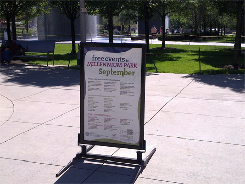
From a distance, you can barely see the QR code at the bottom right of the sign. I saw it, but I digress. Here’s a closer shot of the sign.
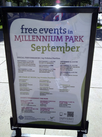
I was able to get a closer shot, but I had to squat down to take the picture.
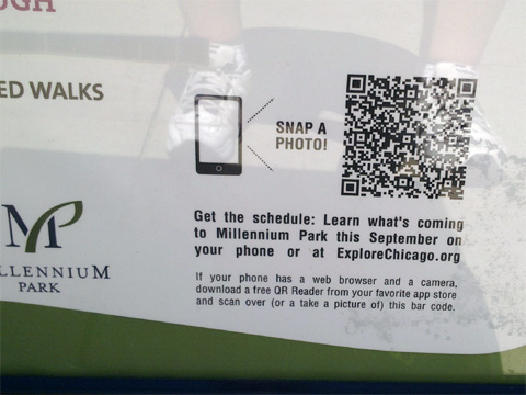
The code did work at the time, but it brings up an error, now several months later.
Where it’s always nice to see a QR code in action, why implement one so poorly? The position so low to the ground makes it less likely to see, let alone scan. If you do scan it, you’d have to squat down or have to bend over in an awkward position. The description accompanying the code could be made much clearer and concise. I also encountered issues scanning the code as the protective clear plastic over the poster caused a reflection and didn’t allow me to quickly scan the code.
How could this have been improved? By simply moving it from the bottom right to the top right would have helped adoption. This would have positioned it at just above waist level, that is for someone like myself just under 6 feet. Making the accompanying text clearer may have helped as well, or simply having it say, “scan here or visit explorechicago.org” would have been all that was needed.
So, would you have even bothered to have scanned a code in such a location? Share that or any other thoughts in the comments of this post.
Did you enjoy this? Subscribe to The Hot Iron by RSS/XML feed or Read by Email.
This is from The Hot Iron, a journal on business and technology by Mike Maddaloni, Founder and President of Web consulting firm Dunkirk Systems, LLC.
Build • Mobile Technology • QR Codes • QR Codes In Action • (1) Comments • Permalink
Nokia E7 Unboxing Video And Initial Observations
Thanks to the folks at WOMWorld/Nokia I have received a brand new Nokia E7 mobile device to evaluate. I made the following video of the opening of the package and unboxing the device. It is embedded below, or follow this link and view it on YouTube.
As you can see (if you watched it) WOMWorld/Nokia outdid themselves again and created a custom outer wrapper for the device with a tweet I sent and signed by Nokia’s new CEO Stephen Elop.
The E7 is a solid device – made of metal, and feels solid when you hold it. This isn’t the first time I held an E7, as I got to try a pre-release model owned by Nokia staff when I went to Microsoft TechEd last fall in Berlin, but this is the first time I got to try it out myself. As a result, I gave the slide-up of the display to expose the keyboard a good workout, for as I said in the video, I work a device to its fullest extent!
Off To The Races But With Caution
Now that I have unboxed the E7, I will charge it, put in my T-Mobile SIM card, sync the device with my contacts and calendar and use it as my primary device. I am interested in getting to know the Symbian^3 operating system, use the camera and make my own observations on it, take advantage of the full keyboard and just plain see how it works for me.
That being said, as I was charging it and I was getting a feel for device, I made an observation I hadn’t heard before – there are no holes in the device to attach a wrist strap! I say this with an exclamation, as every Nokia device I have used over the years – going back to the Nokia 105 I had in the early 90’s - had them. Though I don’t have a wrist strap on my Nokia E72, I see the need for one on the E7 namely due to how I see using the camera. As it has a full touch screen and with the positioning of the shutter button, I would want the strap for both positioning the camera and ensuring I don’t drop the device! As the E7 has a flip screen, I can’t see how a case could be wrapped around it which would have wrist strap holes.
Look for more to come on the E7. Is there something you would like me to try out on the device? Share your ideas and thoughts in the comments for this post.
Did you enjoy reading this? You are welcome to subscribe to The Hot Iron by RSS feed or by email.
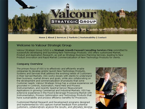
Dunkirk Powers Valcour Strategic Group Web Site With MojoMotor
We at my Web consulting firm Dunkirk Systems, LLC are proud to announce the re-launch of a Web site that barely looks different than before, but has a completely new infrastructure behind the scenes.
Valcour Strategic Group, LLC is a long-time Dunkirk client and we have collaborated on mutual client projects in the past. Valcour is a Strategic Growth Focused Consulting Services Firm committed to developing and launching New Technology Products that benefit the Water, Food, and Beverage Processing Markets in North America. Their Web site at www.valcourstrategic.com has been live for several years, and has been a static Web site, meaning any changes to the content of the site were a technical task to change hard-coded Web pages. This posed issues with making even the smallest of changes as soon as they were needed. Valcour needed greater content management capabilities with their Web site, but their needs were straight-forward and didn’t need a robust CMS, at least not yet.
After making many changes to their Web site and understanding their needs, I felt a new CMS called MojoMotor would solve their needs, and it is now live powering their Web site. MojoMotor was released last fall by EllisLab, who also offer ExpressionEngine, Dunkirk’s preferred CMS upon which we have built many client Web sites, blogs and forums. MojoMotor positions itself as “the publishing engine that does less,” and the question was if less was more for Valcour. After reviewing the technology with Norman LaVigne, Valcour’s founder and president, he gave the ok for the project.
So how has MojoMotor worked for Valcour? In hs own words, Norman said, “I have made numerous text updates since going live with MojoMotor. I like the ease of doing this so I can tweak something on the site quickly and keep it aligned with my business without having to accumulate changes and do them all at once later.”
Dunkirk is now offering MojoMotor as part of our CMS offering. There are many times when a robust CMS is needed, and in some cases it is not. A great feature of MojoMotor is a built-in upgrade path to ExpressionEngine. Where a Web site may start out with basic needs, when those are exceeded, there is a path to expansion, and greatness!
Did you enjoy reading this? You are welcome to subscribe to The Hot Iron by RSS feed or by email.
Microsoft Playfully Asks You To Stop Using Internet Explorer 6 Web Browser
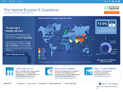
Microsoft recently launched a program for “moving the world off Internet Explorer 6” called the Internet Explorer 6 Countdown, aptly at IE6Countdown.com. For some of you reading this, hearing about this may be somewhat amusing, for others, you may not know why Microsoft would want this to happen. I will try to address the reasons for upgrading your browser here, and why many – including myself – want IE6 to go away!
A Lot Has Happened In A Decade
IE6 was launched on August 27, 2001. A lot has happened in the area Web technology since then. Web programming standards have changed, with an emphasis towards heavy use of cascading style sheets (CSS) to position content on a Web page, when previously HTML tables were used. This has made Web code “lighter” in it’s physical file size, as well as ease of maintenance. As IE6 itself has not changed, many newer Web pages may display differently, or not display at all. This forces Web designers and developers to add functionality and code to display specific code on IE6 that is different than on other browsers, which only adds to future maintenance.
As well, other browsers have entered the marketplace, including Mozilla Firefox, Google Chrome and Opera. These browsers have been designed to render newer Web standards properly, though each has its own nuances. Not to mention newer features to the browsers, such as tabbed browsing and subscribing to RSS feeds. One feature of these other browsers is in their ability to “self-update” and apply incremental changes to the browser software, and prompt the user to download completely new versions of the browser. IE6 does not do this. Windows Update will prompt a PC user to install a new browser version or incremental browser update, but the user can opt not to install them. In some cases, a user may not even have the option – these tend to be corporate users, who centrally control what updates are made on a corporate computer.
Another reason why corporate users may not use the latest browsers is due to some corporate Web applications requiring IE6 to run. Many of these apps may not have a business need to change, thus corporate IT staff have made no efforts to upgrade the browsers. Only newer versions of Windows have come with newer versions of the browser, and hopefully by then these apps have changed for the newer versions.
So Why A Campaign?
Microsoft relied on people to upgrade the browsers themselves, and in many cases the browser never updated or upgraded. Also, IE6 was viewed as slow and unfriendly, which attributed to a migration away from them. People may use IE6 on occasion – for certain Web apps that required it – but would use Firefox or another browser as their primary browser. Thus not only did IE6 lose market share, IE browsers overall lost market share. So why not a marketing campaign to bring attention to the browser already installed on your PC?
Where the idea of a campaign around a countdown to IE6 going away is interesting, it’s just that – clever marketing. If you look at the chart on the IE6 countdown Web site, the country with the largest use if IE6 is China, which raises all sorts of questions around piracy as well as their ability to even get access to the newer browsers.
As someone who build Web sites, I have IE6 installed on a computer I use, and this is namely for testing my Web sites. My primary browser is Firefox 3, and I also use Google Chrome on occasion, both for Web browsing and testing Web sites. I agree the world would be a better place without IE6. Unfortunately I don’t think this campaign will make it go away completely.
I once had an idea about how to rid the world of IE6 – rather than have a marketing campaign, hold a contest for someone to write a virus or malware which would replace a version of IE6 with a newer version of IE. Though ethics heavily come into play, it would certainly be more effective!
What do you think of this campaign? Do you still use IE6? I welcome your thoughts and reasons in the comments of this post.
Did you enjoy reading this? You are welcome to subscribe to The Hot Iron by RSS feed or by email.


