Digital Spring Cleaning
Call it a rite of passage or a subconscious impulse, but there is just something about the weather getting warmer and wanting to get rid of excess possessions. Though Spring is only a few weeks in as I write this, perhaps it was the warmer weather in Chicago (hello, a cookout in February?) that got me started with this sooner.
Personally, as I have purged much of the excess tangible things I have acquired over the past years, my spring cleaning this time was more virtual – specifically, digital. I have been carrying around some digital baggage for a while that was beginning to wear on me, let alone cost me money.
So I exchanged my broom and dustpan for my fingers and a physical trash can for one on my desktop and did the following.
Archive Excess Files Off My Computer – When I bought my Macbook I purposely got the maximum available memory and a smaller hard drive. Why? I don’t want to carry around a lot of unnecessary files. So I scoured my hard drive for what I truly didn’t need to carry around and 1) deleted what I didn’t need to own at all, and 2) archived what I needed to keep.
This activity freed up a lot of space on my hard drive, making searches more efficient, and mitigated the need to buy more online backup space, what I use it as part of my digital backup strategy.
Shuttered Old, Inactive Web Sites – As someone who, among other technology skills, builds Web sites, I still had out there a few sites that, though I had high hopes and intent for, had languished due to lack of time as well as changes in my personal priorities. So I closed them – backing up all of the code and databases – and in most cases redirected the domain names to my blog at TheHotIron.com (link) where you are likely reading this.
I would be remiss to say some of those sites still had some sentimental meaning to me, but in the end, it save me some emotional baggage, and led to the next cleaning task going a lot smoother.
Consolidated Web Hosting Accounts – All these Web sites and services have to live somewhere, and for me they were with multiple companies. My goal was to consolidate the 4 of them into 1. However, as I got into it, I decided to leave it to 2 for reasons that, if this isn’t boring enough for some of you reading it, would certainly put you to sleep!
Where this task saved some money, it also allowed me to isolate and think about what I need for Web hosting, leading to an even better way to manage it, and save even more money. This is a work in process as a result, but one that has already deliver gains.
Dropping Domain Names – As someone who has worked a lot with domain names, from advising to managing domain name portfolios for individuals to publicly-traded firms to everyone in between, it’s probably needless to say I have registered a number of domain names for myself over the years. Just like a financial portfolio, a domain name portfolio has to be reviewed, evaluated and changed periodically. In this case, that included dropping domain name.
For this task, similar to dropping domain names, there were a few emotions I needed to put aside. In other cases, I just realized having the .com for a domain was enough and the .biz and .info were not needed. The savings from this cleanup will pay over time as some domain names don’t renew right away.
Antialiasing, or Deleting Email Addresses – Over the years I have employed various strategies to manage email. Where some have worked great, like managing my inbox to zero (LINK), others proved to be more work that saved. This was the case with setting up email aliases or forwarders, which were separate email addresses that forwarded to my main email address. I set them up to use for specific purposes, like eCommerce (.(JavaScript must be enabled to view this email address), noting xyz.com is not my email domain!) and mailing lists (.(JavaScript must be enabled to view this email address)), etc. Et. Al., yada-yada, henceforth… you get the picture.
As you might guess, I had a lot – over a dozen aliases when I stopped counting – and though they were not being actively used, they were the destination for most of my spam email. So I deleted them, or “antialiased” as I like to call it. I now have 1 email address, and a heck of a lot less spam.
Canceled My Yahoo Accounts – As Spring rolled around, so did the word that Yahoo had yet another major password breach. I have had Yahoo accounts for over 20 years, namely using them as backup email addresses and tying them to Flickr accounts when they acquired the photo sharing service. As time went on, I never used the Yahoo portion of the accounts, as well uploading photos to Flickr went out of vogue for me.
So it was with less emotion that I canceled my Yahoo accounts. Nobody was emailing me at those addresses, and there was little traffic to my Flickr photos. Granted all of those photos will disappear from the Web, but if anyone really needs to see pictures of me sitting on the visitors dugout bench at Wrigley Field, contact me directly.
Deconstructing Digital Spring Cleaning
Digital Spring cleaning is similar to eliminating tangible items, but is more for peace of mind, not to mention possibly cost savings. This peace of mind gave me the same relief I get by packing up a box of stuff and shipping it to GiveBackBox or dropping it off at Goodwill. It is also something I will plan doing every year along with getting rid of physical crap.
Have you done digital Spring cleaning yourself? Or have you even thought of it before? I welcome your thoughts on it in the comments to this post.
This is from The Hot Iron, a journal on business and technology by Mike Maddaloni.
Did you enjoy this? Subscribe to The Hot Iron by RSS/XML feed or Read by Email.
Domain Names • Strategize • Technology • Thrive • Web Development • (0) Comments • Permalink
3 Challenges of In-App Web Browsers

Quick – how many Web browsers are on your mobile phone?
Now I realize this question may confuse you, but please read on, as I may be talking about something completely new to you or something you know about but didn't realize its full impact and the challenges that come from it.
The Mobile Web Is Still a Thing
With the growth of mobile devices and apps, many predicted the Web would be less relevant. With advances in Web design, namely the concept of responsive Web design, where a Web site will adapt or :respond: to the size of the screen it is presented on, Web sites are still viewed on mobile devices, and this will certainly continue.
To view Web sites on a mobile device, like on a PC or Mac, you use a Web browser. This in itself is an app, and on the iPhone the “native” browser is Safari and on an Android phone, it's Google Chrome. As well, you can install other browsers like Opera or Firefox. Just as on the desktop or laptop computer, some people just use the native browser and others use another. Some use more than one, realizing one may present a Web page differently than another – that difference can be slight, or to the extreme the Web site functionality may not work at all. Unfortunately there is no strict standards that a Web browser must follow to display Web pages, thus the differences.
The More Not The Merrier
As you may guess, the more Web browsers there are, the greater the chance these differences – or errors – may occur. I personally have encountered this many times as a regular Web user, as well as someone who owns and builds Web sites.
To compound the number of apps out there that are Web browsers are apps that serve a unique purpose but also have a Web browser built into it.
Again, my apologies if I have confused you... Web browsers in apps? Which ones? And how many different ones? And why? Where I have some answers to these, I am not a mindreader, though as someone who has designed products as well as software, I will share with you my thoughts as to why, and their impact.
As for the which and how, the image at the top of this post shows 8 apps I currently have installed on my iPhone that have an in-app Web browser. Eight! One is Safari, the iPhone native Web browser, and the other 7 are inside apps. As for the why, this depends on the thought and design of the app owners and developers.
Here's one thought as to why: the chief reason is the user experience – click a Web link in an app and you stay within the app. Granted you can launch a separate Web browser on your mobile device, but the user is then leaving your app, where you want them to stay. Talking with some Web app owners off-the-record, they have also said this, as well as functionality of the app they would like to leverage in the Web browser. So as I said, they have their reasons.
Challenges All Around
After this setup, it may already be obvious as to what the challenges to in-app Web browsers are, and who they impact, including:
Challenges to App Users – Thats you and me folks, the end consumer of these apps and their browsers. There's a real-world example tha
t happened to me that first brought this to my attention.I went to an eCommerce Web site to make a purchase, one I have been to man times on a mobile device as well as my Mac. However a popup window that normally comes up as the last step of the process to complete the order did not appear. I tried and tried a couple of times and it still did not complete the order. It wasn't until I realized I was in an in-app Web browser and not Safari, which I had used in the past. I then opened Safari on my iPhone, tried the order again and it worked just fine.
Even for someone like myself who considers himself a high-end user, I didn't think twice on what app I was really in, and once I did, it still didn't matter, as I wondered why the Web page didn't work?
Challenges to Web Site Owners and Developers – One of the greatest challenges to those who run and build Web technology is that their Web sites and Web applications work in browsers. This may be even more challenging than the site being of value and compelling to the end user.
Going back over 20 years there have been the need to test and verify Web sites on all PC and Mac Web browsers, as well as on other computer operating systems, which back then you could count on one hand. Add to it mobile devices, tablets, watches and multiple brands of browsers on each, not to mention different versions (not everyone is on the latest version!) it can be overwhelming.
Overwhelming, and expensive. The need for a quality assurance (QA) lab, equipment (basically at least one of each piece of hardware), staff, third-party consultants, services and software... you don't even need to be technical to realize the magnitude of it.
Challenges to App Owners and Developers – If you decide you need/want a Web browser in your app, you are basicaly doubling the functionality to build and support in your app. A Web browser is a beast all into itself – and now you have one. You need to test your browser with the latest Web technologies and standards, consistently. You also need to keep up with the competition – standalone Web browsers – as to their features and how they deliver Web pages. And where you have the staff to develop your app, you will need to expand it for the Web browser functionality as well.
This goes beyond the technology and into your product management and development. Where it may be ideal to have that tightly integrated browser, the overall question must be, at what cost?
Supporting not Scaring
As business needs and technology are always a moving target, it's good to have an idea of what may be in case you ever lose scope or focus on it. I hope after reading this I haven't scared you – saying you have almost a dozen of something when you had no idea can be a bit much.
I welcome your thoughts on multiple Web browsers in the comments of this post. I promise not to scare you anymore now... on this topic anyway!
This is from The Hot Iron, a journal on business and technology by Mike Maddaloni.
Did you enjoy this? Subscribe to The Hot Iron by RSS/XML feed or Read by Email.
Build • Mobile Technology • Technology • Web Design • Web Development • (1) Comments • Permalink
Google Contributor Offers Interesting Approach To Blog Revenue
Editor's Note: Google Contributor is no longer operating for general use as indicated below, and this post was edited to remove links to their Web site and embedded elements that are no longer functioning.
Would you pay money to read The Hot Iron? And what if by paying you saw less ads on the site?
I know I have asked this question before when I added CentUp to this very blog. Another new revenue model for writers has come about from Google called Contributor. As I have no illusions (delusions?) of grandeur in earning a living from this very site alone in itself, I was more intrigued to try it to how it really works.
How It Works
Google Contributor allows a Web user to contribute money monthly for ads to not be shown on Web sites it visits. The ads specifically are ones from Google’s own ad services, AdSense and DoubleClick. So if a banner ad comes from another source other than Google (and there are many) that ad will still appear. In the place of the ad it may be blank or a thank you message for supporting the particular Web site.
From the Web site owner’s perspective, if they are displaying on their site through Google, rather than getting the money for someone seeing and clicking on an ad, they are getting money from the user’s Contributor account, in a sense offsetting the cost of the ad usually paid by the advertiser.
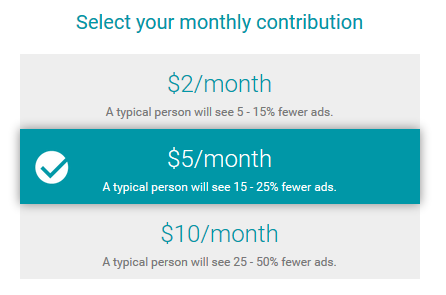
A few items of note on Contributor. Currently it only works in the US. By someone contributing money, either US$2, US$5 or US$10 a month, they are still going to see ads. As shown in the chart below, by contributing those 3 previously mentioned dollar figures, they will see respectively 5-15%, 15-25% or 25-50% fewer ads. These fewer ads are across all Web sites with Google ads not just one in particular. So if you contribute $10 a month, thinking it will all go to me for reading The Hot Iron, it will not.
Is It Worth It?
That’s a great question – is it worth it? I honestly don’t know, as I have just set it up on the blog, and I have also signed up as a Contributor at the whopping US$2 a month level.
Here is a screenshot of this blog with an ad appearing at the top:
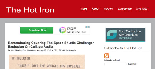
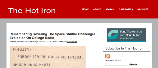
I know – the difference is amazing!
It will be interesting to see how often I notice the ads not there. Last year was the 20th anniversary of the Web banner ad. As I heard somewhere – and I forgot the source – it was marking 20 years of people ignoring banner ads! So even if it technically works, it will be interesting to see if anyone notices.
Are you a Google Contributor? Did I convince you to join, or not join? I welcome your thoughts in the comments of this post.
This is from The Hot Iron, a journal on business and technology by Mike Maddaloni.
Did you enjoy this? Subscribe to The Hot Iron by RSS/XML feed or Read by Email.
Blogging • Business • Technology • Web Design • Web Development • (2) Comments • Permalink
Revisiting My Web Site Redesign Checklist
There comes a time when we reevaluate something we are doing. This thing may be an ongoing activity or something is simply still “around” that requires little to no attention, but is something we are aware of. The thought process involved in determining to continue or suspend something can be interesting in itself, and can lead to a go or no-go or a change to what it is we are doing.
Among my seemingly too many projects and activities is something I am still proud of, but wondered if I should keep it out there. About 5 years ago I launched The State of Your Web Site within my former Web consulting firm. It is a checklist of 34 items which I felt are important to the vitality of a Web site. As I later wrote in a post about the process of creating it and naming it, a lot of work went into it. That being said, should I still keep it out there in the Internet eye?
The evaluation process boiled down to 2 points – 1 for and 1 against it. The con is the amount of time that Is needed to keep something like this current, as tools and technology and trends are always evolving and changing. As it is almost 5 years old now, there are some parts of it that are in need of updating. The pro, however, is that people still seek my advice on their Web site, despite that I no longer offer that as a service any longer (if they need someone, I simply refer them to Visible Logic). For that reason alone, I felt it was worthwhile to keep The State out there, and to spend some time to update it and keep it fresh.
Once I made this decision, another “pro” came to mind – this is a good way to keep my own Web skills sharp. As I am still in the profession of building great Web sites and Web applications, to have a “home” for my research and thoughts would be an ideal use for the checklist.
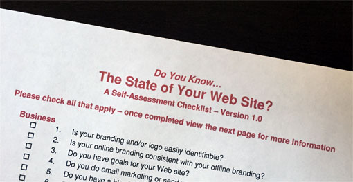
The first step of this process is to do just that – establish a new location to host and offer The State of Your Web Site. This will be the place where, when I review the checklist items and update it, I will post and announce the updates. What better place than right here, at The Hot Iron? Going forward, you will be able to find the latest post on The State at thestateofyourwebsite.com. Right now that link points to the very post you are reading. If a new post had more current information, the link will redirect to it. By clicking on the image at the top or this link you can view the original version of The State – as I said, it came out in 2010, and the list does need some updating, but as you review it you will find some “timeless” items to consider for your Web site.
As I work on updates to The State I of course welcome your thoughts and comments on it – on the list overall to specific elements within it. You can leave them as comments to this post or contact me directly. Your feedback will be vital to the validation of changes to The State of Your Web Site, and I thank you in advance for your time.
This is from The Hot Iron, a journal on business and technology by Mike Maddaloni.
Did you enjoy this? Subscribe to The Hot Iron by RSS/XML feed or Read by Email
Announcements • Build • Business • Strategize • Technology • The State of Your Web Site • Thrive • Web Design • Web Development • (0) Comments • PermalinkEasily Create A UNO Social Site With Free .UNO Domain Name
Personal Web sites are nothing new. Where they started in the early days of the Web – I created my first one in 1994 – they became more popular and pervasive with improved Web publishing tools. Technical knowledge is not even required for most of them, and there are a variety to choose from. So when I heard of UNO Social Sites, I wondered why another brand? When I tried it out and created my own, I found what could be the best way for people of all tech levels to make one.
UNO Social Sites are offered by the .UNO registry, which began offering the .UNO domain name last year when dozens of new global top-level domains (or gTLDs) were made available for registration, I wrote then why I registered my own .UNO domain names and what I felt were the compelling reasons to do so. My intent was to use my domain name, maddaloni.uno, as my personal home page and build a site there. I never did (the domain name now points to this blog), but still wanted to. I don’t need to worry about that as now the .UNO registry has created UNO Social Sites, which are easy to create and customize personal Web sites.
As I mentioned in the above-linked article, I know the people behind the .UNO registry, and they invited me to beta test the service before it went live. After trying it, creating my own site and testing it all, UNO Social Sites, at hello.uno, are now live for anyone to create one, plus get a .UNO domain name… for free. Where some may want this solely because it is a free service that comes with a free domain name, the site you can build is solid and offers some great features. Once you create your account and choose your domain name, you are free to add a variety of information, pictures and feeds to your site.
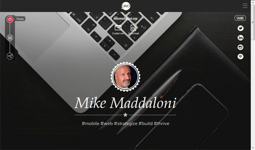
In order to create a UNO Social Site, you need a Facebook account. As I don’t use Facebook personally, I inquired why and was told this is solely for verification of your identity. As you can see from my own page pictured above at mikemaddaloni.uno there is no link to Facebook for me, as I was able to use a Facebook account I created solely for this purpose.
Among the features of the site you can customize are the following:
- Name, photo, tagline, “about me” description
- Background photos – 1 or up to 3 that rotate
- Responsive site templates, which means they size nicely for large and small screens, and within them choices of fonts, text sizes and colors
- A contact link which will send an email to you, as well as an email forwarding address using the domain name
- A link to your CV or resume which you can upload as a file
- Links to your chosen social media feeds, and a snapshot of those feeds
- Something called “My UNO Moments” where you can create a custom collage of photos and text
If all of these customization options are too much for you, coming soon Is the ability to create a page from information on your Facebook page with simply a couple of clicks.
With the variety of customization options, you can create a site with either a social or business focus. Though called “social” sites, you could create a site that is solely for your job search or business, with links and feeds just to LinkedIn, for example. Otherwise you can have it as a multipurpose one as I do for both personal and business. Having the link to your CV or resume upfront is a handy feature, and good way to share more on your profile when exchanging information with a prospect client or job recruiter.
There is also an option to explore others who have a UNO Social Site and follow them. I haven’t used this much other than to see how others have configured their sites, and it has given me some good examples. From what the people at the .UNO registry have told me, these are just the beginning of features and more will be offered in the future. You can see how to setup a site with the video embedded at the bottom of this post, or link here to view it on YouTube.
If you do not have a personal site, or do have one but may want a new approach to one, I recommend getting an UNO Social Site. Whether you have created one, or not, I welcome your thoughts on it in the comments of this post.
This is from The Hot Iron, a journal on business and technology by Mike Maddaloni.
Did you enjoy this? Subscribe to The Hot Iron by RSS/XML feed or Read by Email.
Build • Domain Names • Mobile Technology • Social Media • Technology • Thrive • Web Design • Web Development • (0) Comments • Permalink


