QR Code In Name.com Email Links To Android App Download
In the past I have said QR codes are a way of tying the offline and online worlds. After seeing the use of a QR code I am writing about today, I am changing that statement to this: QR codes are a nexus between mediums.
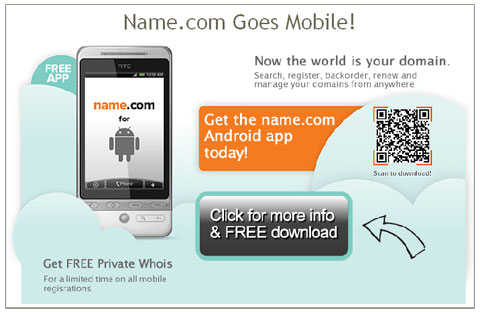
Name.com is a great domain name registrar I use personally and for my business (note the link is an affiliate link). They have a clean and intuitive user interface that does not bombard you with upselling options at every click! They also provide outstanding and efficient human support whenever I need it. As part of that service, Name.com have recently launched an app for Android mobile devices, allowing you not only to register new domain names, but backorder domains as well as manage your entire account. They announced this with an email message as pictured below.
In it, there is a QR code. It links to a page on their Web site for the app. The email message is consistent in design with the Web page. The options they include on this Web page, including the ability to download it by SMS (texting to us in the US) and email, as well as a QR code taking you directly to the Android Market.
In this case, the QR code was a bridge between digital mediums – email and the Web. Of course if I read this email on my mobile device I wouldn’t be able to scan it, but as I opened it from within my Thunderbird email client, it worked. An argument can be made whether to link directly to the Android Market from the email rather to a landing page which then links to the Market. This is a great scenario for performing A/B or split testing on the email message, which they may have done anyway. Overall I believe this email from Name.com does a decent job of communicating the value behind the QR code.
What do you think of this QR code use? Would you link directly to the Android Market? Have you or would you use a QR code in an email message? You are welcome to share your thoughts and opinions in the comments of this post.
Did you enjoy reading this? You are welcome to subscribe to The Hot Iron by RSS feed or by email.
Microsoft Playfully Asks You To Stop Using Internet Explorer 6 Web Browser
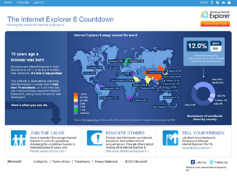
Microsoft recently launched a program for “moving the world off Internet Explorer 6” called the Internet Explorer 6 Countdown, aptly at IE6Countdown.com. For some of you reading this, hearing about this may be somewhat amusing, for others, you may not know why Microsoft would want this to happen. I will try to address the reasons for upgrading your browser here, and why many – including myself – want IE6 to go away!
A Lot Has Happened In A Decade
IE6 was launched on August 27, 2001. A lot has happened in the area Web technology since then. Web programming standards have changed, with an emphasis towards heavy use of cascading style sheets (CSS) to position content on a Web page, when previously HTML tables were used. This has made Web code “lighter” in it’s physical file size, as well as ease of maintenance. As IE6 itself has not changed, many newer Web pages may display differently, or not display at all. This forces Web designers and developers to add functionality and code to display specific code on IE6 that is different than on other browsers, which only adds to future maintenance.
As well, other browsers have entered the marketplace, including Mozilla Firefox, Google Chrome and Opera. These browsers have been designed to render newer Web standards properly, though each has its own nuances. Not to mention newer features to the browsers, such as tabbed browsing and subscribing to RSS feeds. One feature of these other browsers is in their ability to “self-update” and apply incremental changes to the browser software, and prompt the user to download completely new versions of the browser. IE6 does not do this. Windows Update will prompt a PC user to install a new browser version or incremental browser update, but the user can opt not to install them. In some cases, a user may not even have the option – these tend to be corporate users, who centrally control what updates are made on a corporate computer.
Another reason why corporate users may not use the latest browsers is due to some corporate Web applications requiring IE6 to run. Many of these apps may not have a business need to change, thus corporate IT staff have made no efforts to upgrade the browsers. Only newer versions of Windows have come with newer versions of the browser, and hopefully by then these apps have changed for the newer versions.
So Why A Campaign?
Microsoft relied on people to upgrade the browsers themselves, and in many cases the browser never updated or upgraded. Also, IE6 was viewed as slow and unfriendly, which attributed to a migration away from them. People may use IE6 on occasion – for certain Web apps that required it – but would use Firefox or another browser as their primary browser. Thus not only did IE6 lose market share, IE browsers overall lost market share. So why not a marketing campaign to bring attention to the browser already installed on your PC?
Where the idea of a campaign around a countdown to IE6 going away is interesting, it’s just that – clever marketing. If you look at the chart on the IE6 countdown Web site, the country with the largest use if IE6 is China, which raises all sorts of questions around piracy as well as their ability to even get access to the newer browsers.
As someone who build Web sites, I have IE6 installed on a computer I use, and this is namely for testing my Web sites. My primary browser is Firefox 3, and I also use Google Chrome on occasion, both for Web browsing and testing Web sites. I agree the world would be a better place without IE6. Unfortunately I don’t think this campaign will make it go away completely.
I once had an idea about how to rid the world of IE6 – rather than have a marketing campaign, hold a contest for someone to write a virus or malware which would replace a version of IE6 with a newer version of IE. Though ethics heavily come into play, it would certainly be more effective!
What do you think of this campaign? Do you still use IE6? I welcome your thoughts and reasons in the comments of this post.
Did you enjoy reading this? You are welcome to subscribe to The Hot Iron by RSS feed or by email.
Next likemind Chicago on Friday March 18
 The next likemind will be Friday, March 18, 2011 in dozens of cities around the world.
In Chicago, it will be at Argo Tea, 140 S Dearborn St. at the corner of Adams and Dearborn Streets in the Loop from 8:00 am to 10:00 am.
I call likemind a gathering of creative-minded people, from various disciplines including Internet, advertising, art, social media, et. al. For more on likemind, read this great article on likemind Chicago from the Newcity and likemind from the New York Times.
Follow @likemindchicago on Twitter. You are welcome to join the likemind Chicago Facebook group.
Watch for future date announcements at http://likemindchicago.com/ - and Web site coming soon at that address!
Did you enjoy reading this? You are welcome to subscribe to The Hot Iron by RSS feed or by email.
Kellogg’s New Crunchy Nut Cereal Uses QR Code To Reinforce Marketing
A visit to the cereal aisle of a US supermarket is always an overwhelming experience, as with each visit it appears that there’s even more choices to make. In this crowded field of breakfast foods, you need to stand out somehow, and why not with a QR code?
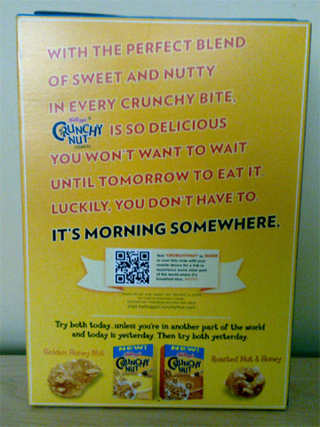
A new variety of cereal, Crunchy Nut from Kellogg’s, featured a QR code on the back of its cereal box as shown below:

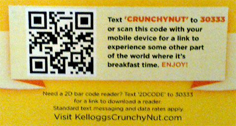
Note there was not a QR code on the front of the box, and I discovered this when I went to buy the cereal. The detail of the QR code is shown below:
Upon scanning the code, you are taken to a mobile Web optimized site where it shows a video reinforcing its marketing message about eating the cereal day or night because “it’s morning somewhere.” I have visited the site a few times and I observed different videos.
This a good example of a presentation of a QR code as well as what it links to. In a prominent location, the message offers both the option to send an SMS message or to scan the code, and below it tells the cereal eater how they can get a reader app, and if they do so, they may be charged for it. In this case, Kellogg’s chose to call it a 2D bar code, and my guess all of this text was vetted by their legal department and thus it is called as such, as technically QR code is a trademarked name, but offered as an open standard.
Only if the cereal lived up to the quality of the QR code presentation – it was a little bland for my taste, and not that crunchy either, but I digress. The QR code won me over in this case.
Did you enjoy reading this? You are welcome to subscribe to The Hot Iron by RSS feed or by email.
Web Images Physical Dimensions Should Match Display Dimensions
One of the great things about the proliferation of content management systems and blogging is the ability to publish whatever you want, including text and photos and images. One of the not so great things about this is that things can be published in a far from optimal format, leaving quality on the floor in the name of convenience. Specifically, I am writing with concern over how images and photos are often published and look fuzzy or are slow to load. This can be easily remedied with simply realizing the physical dimensions of an image to match the desired display dimensions.
Here’s an example to illustrate my point, literally, of what we at Web consulting firm Dunkirk Systems, LLC advise to our clients all the time. As it’s a nice and cold day in Chicago as I write this, why not use a photo of Panama City Beach, Florida taken earlier this year, as shown below.

The dimensions of the photo below are 480 pixels wide by 318 pixels high. The original dimensions of the photo were 2,048 x 1,356 pixels, which is not only much too large to display within the layout of The Hot Iron but too large for most blog feed readers. Using the most basic features of PhotoShop, I reduced it to the size above. As a result, the physical dimensions of the photo match the display dimensions, not to mention the size of the file being much smaller as well.
The alternative to this would have been to add the photo to the blog post and resize its dimensions “logically” by adjusting the HTML display dimensions. This would have had 2 negative impacts on the beautiful picture. It would have appeared grainy or pixilated as I am simply squishing the image without altering its physical size. Also, it would have taken longer for it to appear, as the filesize would be 10 times larger than the physically resized image.
Larger images logically resized appear more than you would think, or now would like. I see it on blog posts, Web sites for businesses as well as email newsletters. The user experience is often where the entire page loads and the photo or image slowly appears, line-by-line, from top to bottom. Many times I have been tempted to contact the owner of the Web site or newsletter, however from past experience such submitted issues go unresponded to.
So how do you resize your images? Many of you may already have software to do this installed on your PC or Mac – some may come from the OS itself, or in the case of Windows it may be pre-installed software from the hardware vendor. Some digital camera software comes with basic editing tools. Some online photo sites may offer editing and resizing capabilities as well. You can also acquire a full copy of Adobe Creative Suite, or its lower-priced cousin PhotoShop Elements.
With a little bit of work, you can provide a greater experience to your readers with good looking photos and images displayed in an optimal way.
Did you enjoy reading this? You are welcome to subscribe to The Hot Iron by RSS feed or by email.


