Bad Captcha
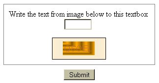
 If you have ordered something online or posted a comment to a blog, you have seen captcha. It was originally developed as a method prevent robots from automatically submitting forms on a Web site by requiring a person to visually view text in an image and enter its value in the form, something a robot should not be able to do.
Where it has a noble purpose to prevent bogus information going to a Web site owner, it is a roadblock to someone who is visually impaired using a form. And as you can see from the example I grabbed from a Chicago-based Web site, it can be hard for those who do not have any visual impediments to decipher.
I made a decision to not use captcha on The Hot Iron or on Dunkirk Systems’ Web site. I do have logic in the forms to try to thwart bogus submissions, but they still get through. Comment moderation is enabled on this blog, requiring me to approve a message. Where this slows down legitimate comments from going live, not to mention more work on my part, it provides a better user experience for you the reader. This I value more than deleting a few offers for pills and watches.
As for the Web site I took this captcha example from... their privacy policy and Web site copy did not make it clear what was to be done with the information submitted using the form, so it was another strike against be using it.
Technology • (10) Comments • Permalink
