Ah, the days when you didn’t have to pay extra to check bags onto a flight. Just about every US carrier, with the notable exception of Southwest, now charges for checking the 1st 2 bags onto your flight. Where you can pay the bag fee at the airport when you check-in, some airlines have integrated payment into their online check-in process. One such airline is AirTran. In their case, they simply hacked existing Web functionality to do so, and along the way insulted me for checking a bag onto my flight.
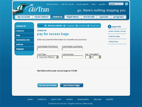
As I checked in for my most recent flight online, I was prompted to select the number of bags I was to check. I selected 1, and clicked the button to continue. On the next page, I was surprised to see the Web page title – pay for excess bags – as you can see below.

The following image is a crop of the page title.

What? This is not an excess bag, it is my only bag! As someone who builds Web sites, I know why this is the way it is and what their developers did. They simply changed the threshold value for what is an “excess” number of bags from 3 to 1 – remember, AirTran and other airlines used to allow you to bring your 1st 2 bags for no additional charge. Where the functionality works fine, by not changing the words on the Web page, AirTran is being misleading, not to mention snarky. And it doesn’t end with the page title – look at the label of the submit button, which I have cropped below.

As you can see, it is labeled “purchase bags.” I am not acquiring a new bag, I am paying a fee, and one which to begin with I don’t want to. Please don’t sugar-coat the messaging, as it would be better to simply label the button as “submit” or “continue” rather than to attempt to be creative.
I fault this with the AirTran Web site product manager or whoever in their marketing department is the business owner of the Web site. Don’t blame the techies here, as it functions correctly, and that’s probably all they care about.
This is a good example of not knowing about what your customers look at everyday. Print out all of the pages of the Web site and put them on posterboard if need be, so that when a change is required, the function as well as the form are in sync.
Did you enjoy reading this? You are welcome to subscribe to The Hot Iron by RSS feed or by email.
Business •
(4)
Comments •
Permalink
Comments
Great find as always, Mike! This one is too funny, and definitely sensitive during today’s lean times for the air travel industry.
They *could* have a bit of humor with a separate purchase price for guitars. Check Excess Guitars, and “add Guaranteed Unbroken for an additional $19.95.”

Comment by
Tim Courtney
on 09/24/09 at 02:35 PM
That would have been classic Tim!
From my own experience, the only airline out there with a sense of humor is Southwest…
mp/m

Comment by
Mike Maddaloni
on 09/24/09 at 02:55 PM
Wow! AirTran needs to hire a good business architect…! Or work with Dunkirk Systems!!! This is basic web design and testing baby! it’s not 1999, it’s 2009 this should be streamlined by now!

Comment by Amy Chasse
on 09/25/09 at 02:51 PM
Good find.

Comment by
Thejesh GN
on 09/28/09 at 11:58 PM
Post a Comment
Note: Comment moderation is active, and your comment will be viewable once it is reviewed.


