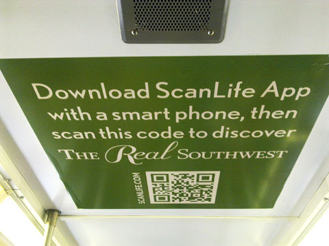
Where last time I talked about QR codes on a Chicago transit station platform this time I am stepping into the car, where I am surrounded by a single ad campaign and large QR codes, as you can see in the photo below.

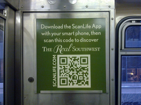
The photo shows an ad for The Real Southwest, which is being sponsored by the Tucson, Arizona Convention and Visitors Bureau. All of the ad spaces in this train car are for the same campaign, which is becoming more and more common place. What is interesting about the photo above is that it is of the ad affixed to the ceiling of the train car! The photo below shows a similar ad, but at eye level, and with a one word difference – can you find it?

The actual train car I was riding on was full so I was not able to get other pictures without annoying other passengers any more than I was when I took these. Not every ad had a QR code on it, but there was always within a standard field of vision.
Instructions Built-In
What’s unique about this ad series is that the instructions are prominent within the ad copy. Many times if there are instructions along with a QR code on what to do with it, they are in small type and located in the corner of the ad. It tells you to get the Scanlife, not to download a QR code reader, which is also unique. And by placing the URL to scanlife.com alongside the code is, again, unique. Of course if you know what a QR code is you will just scan it.
All of the codes I scanned took me to the same web page on the Tucson Web site. What would have been interesting was if they had different QR codes, thereby being able to track which one people scanned to get to the Web site, or having a unique QR code on the ceiling to track how many people look (and scan) up.
What are your thoughts on this ad – is it as unique as I have said it is, or just a good campaign? Please share your thoughts in the comments of this post.
Did you enjoy reading this? You are welcome to subscribe to The Hot Iron by RSS feed or by email.
Build •
QR Codes •
QR Codes In Action •
Web Design •
(5)
Comments •
Permalink
Comments
I’m a geek who thinks the concept is neat - and wants it to be effective, but is afraid might not be. I wonder what the ad agency has to say, when this campaign is compared with others in the past - where budget, placement, etc are similar.
See, I don’t bother to scan QR codes, except on certain items. I’ve scanned ones inside magazines, on handouts and cards - but never on the train. Instead, I’m more apt to open Google and type “Visit Tucson”, or “Tucson Arizona.”
Is that easier? I’m not sure, but when I’m on a moving train - where getting a clear photo is difficult - it sure feels like it.
On the flip side, the marketer in me absolutely adores the novelty, scan-and-you’re-automatically-viewing-my-content element. It’s slick.

Comment by
Nicholas Young
on 02/16/11 at 11:29 AM
@Nicholas - Thanks for your comments! As a fellow geek, yea, I want to try the latest thing. And I too may search for something - it all depends.
Any use of QR codes in the US is still in my mind an early-adoption. Where it is a good way to communicate, it should not be the only way. Offering a URL, phone number, SMS and a QR code - not to mention Twitter and facebook icons - cover all bases. Then measure the heck out of it! There is no added cost or infrastructure needed for a QR code (as compared to an SMS service) so why not try it.
Interestingly, the QR code goes to a standard Web site, as compared to a mobile-optimized site, so for some users, even if they did scan it, they may not like what they see.
mp/m

Comment by
Mike Maddaloni
on 02/16/11 at 12:46 PM
You are becoming a QRack addict! ;)

Comment by
btn
on 02/16/11 at 09:15 PM
@btn - I prefer “strategic” but would settle for addict!
mp/m

Comment by
Mike Maddaloni
on 02/16/11 at 10:14 PM
I like the novelty of it. The simplicity of it makes one curious as to what you’re going to see. After people become more accustomed to the QR codes, they will have to come down in size, or look really dumb.
People have time on the subway, so this is a good way to deliver much more ad content. It should be made to display properly on the cell phone, however.
A lot of potential here.

Comment by
Kevin J. Banet
on 02/17/11 at 03:42 PM
Post a Comment
Note: Comment moderation is active, and your comment will be viewable once it is reviewed.


