 Though I am not an über guru of usability, over the last 20 years of software development I have picked up a few tricks and lessons (many the hard way, the best way to learn) on how useful what you see on your computer screen is and can be. Many times it is familiarity what makes something usable – if you have seen something like it before, the learning curve should be less. And I don’t mean stealing a Web site’s design; think of how most Windows applications start with the first drop down menu being “File” and you’re onto my train of thought.
Speaking of trains, I made a few observations first-hand involving public transportation in Minneapolis. The first was positive, the second threw me in for a loop. I will talk about the great one here, the second one I will save for a post on secret shoppers.
The bus and light rail system in the Twin Cities is called
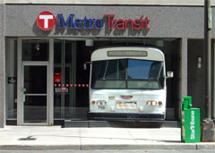
Metro Transit. The accompanying photo shows their name and logo, a letter T centered in a circle. This was extremely familiar to me, growing up in Massachusetts and living in Boston for many years. The Massachusetts Bay Transportation Authority, or
MBTA, is called the T, and has a similar logo. In Twins county, the circle is red, and in Red Sox country, the circle is black.
Having similar public transit logos helped me identified light-rail stations and bus stops. And if my memory is correct, I believe Pittsburgh has a similar logo. What if every public transit system in the US had a common symbol, similar to how most parking lots are identified by a blue background and white letter “P” by the entrance? Or in the world? It would make using public transit that much easier, as you could identify what and where it is. It is only buses and trains, how hard should it be?
Perhaps living in Chicago and learning its transit system and struggling with its inconsistent signage over the last few years had some input into this thought?
Technology •
(4)
Comments •
Permalink
Comments
Hi Mike,
There is a definite tie-in to software and such with your description of the transportation symbols. We all have a strong need for standards in our daily lives. Even in writing this, we hope that each other’s words use the same syntax and letters. (Although some of our “neighbours might not) Anyway, a good example is the need for standards in the Windows operating system. Back in the 90’s, a lawsuit was brought against MS because Windows was unable to make its screens accessible to blind screen reading software. This was mainly due to the lack of homogeneity in MS’s standards for programming. Well, wonder of wonders, they did something about it and hundreds of thousands of blind pc users had doors open to them; from shopping on-line to writing thesis papers. Now some folks rail against this rigidity. Some persons completely steer clear of MS because of their monolithic inflexibility. But there are also valid reasons for standards. Linux is a great example. From what I’ve read, there is great elegance and beauty in the simple and flexible design of much of its eclectic programming. But they are only now beginning to realize how inaccessible their programs are to screen readers. The main problem is a lack of standards.
I’m not an expert in any of this, by a long shot. But, if only we could find some flexible rigidity. BTW, the only rigidity at the MBTA seems to be in making certain that the subway and bus drivers can’t communicate with the riders. The only flexibility seems to be in the hours each T employee works!

Comment by
Don Pedro
on 06/15/07 at 09:57 AM
Where you say you are not an expert in this Don Pedro, you are an end user, not to mention someone with money to spend online! Unfortunately some see accessibility as not worth the investment, but ocne they do, it pays back for them in many ways, namely cash.
mp/m

Comment by
Mike Maddaloni
on 06/15/07 at 10:11 AM
Yes, as I have mentioned before, there are times when all I am looking to do is to find that button that says “purchase” and all I get is “xzqrtvn88-65u!” Very schloppy! The consumer within is vexed and the utilitarian and minimalist artist within is disappointed! Enjoy your coffee this evening!

Comment by
Don Pedro
on 06/15/07 at 10:22 AM
Wow, I don’t think I’ve ever been called an über guru. That seems like a lot of pressure :) As much as I love American individuality, I think we sometimes get in our own way in our drive to express ourselves in everything we do. Every city has to design it’s signs and thinks it can do things better, etc. When it comes to things like public transportation, a little standardization would go a long way.

Comment by
Dr. Pete
on 06/17/07 at 12:43 PM
Post a Comment
Note: Comment moderation is active, and your comment will be viewable once it is reviewed.


