We generally use an image in some different sizes in the same website by CSS image re-sizing. Is it harmful for SEO of that website?
Web Images Physical Dimensions Should Match Display Dimensions
One of the great things about the proliferation of content management systems and blogging is the ability to publish whatever you want, including text and photos and images. One of the not so great things about this is that things can be published in a far from optimal format, leaving quality on the floor in the name of convenience. Specifically, I am writing with concern over how images and photos are often published and look fuzzy or are slow to load. This can be easily remedied with simply realizing the physical dimensions of an image to match the desired display dimensions.
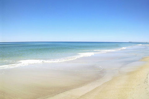
Here’s an example to illustrate my point, literally, of what we at Web consulting firm Dunkirk Systems, LLC advise to our clients all the time. As it’s a nice and cold day in Chicago as I write this, why not use a photo of Panama City Beach, Florida taken earlier this year, as shown below.

The dimensions of the photo below are 480 pixels wide by 318 pixels high. The original dimensions of the photo were 2,048 x 1,356 pixels, which is not only much too large to display within the layout of The Hot Iron but too large for most blog feed readers. Using the most basic features of PhotoShop, I reduced it to the size above. As a result, the physical dimensions of the photo match the display dimensions, not to mention the size of the file being much smaller as well.
The alternative to this would have been to add the photo to the blog post and resize its dimensions “logically” by adjusting the HTML display dimensions. This would have had 2 negative impacts on the beautiful picture. It would have appeared grainy or pixilated as I am simply squishing the image without altering its physical size. Also, it would have taken longer for it to appear, as the filesize would be 10 times larger than the physically resized image.
Larger images logically resized appear more than you would think, or now would like. I see it on blog posts, Web sites for businesses as well as email newsletters. The user experience is often where the entire page loads and the photo or image slowly appears, line-by-line, from top to bottom. Many times I have been tempted to contact the owner of the Web site or newsletter, however from past experience such submitted issues go unresponded to.
So how do you resize your images? Many of you may already have software to do this installed on your PC or Mac – some may come from the OS itself, or in the case of Windows it may be pre-installed software from the hardware vendor. Some digital camera software comes with basic editing tools. Some online photo sites may offer editing and resizing capabilities as well. You can also acquire a full copy of Adobe Creative Suite, or its lower-priced cousin PhotoShop Elements.
With a little bit of work, you can provide a greater experience to your readers with good looking photos and images displayed in an optimal way.
Did you enjoy reading this? You are welcome to subscribe to The Hot Iron by RSS feed or by email.
Comments
Post a Comment
Note: Comment moderation is active, and your comment will be viewable once it is reviewed.

