Google Reader Wants Your Favicon To Brand Your Blog
As the saying goes, a picture is worth a thousand words. But can something that is barely a quarter of an inch square make the difference in whether people read the words of your blog?
Among the recent changes to the user interfaces and experience of Google applications over the past few weeks, favicons are now showing up next to the titles of blogs in their feed reader, Google Reader. Favicons, as I have talked about here on The Hot Iron before, are a 16 pixel square icon that is displayed in the address bar and bookmarks of most all PC/Mac and mobile Web browsers. Their real value is when scanning bookmarks or scrolling thru the history in the address bar as they provide visual cues to which site is which, providing enhanced differentiation from plain text Web URLs. For years I have always added favicons to sites I build in my Web consulting business and I continue to evangelized about them.
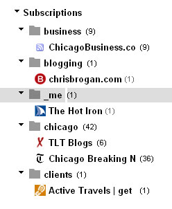
 With the addition of the favicon to Google Reader, not only a reader can leverage this visual cue convenience, but brands of all form – personal and business – can gain by adding a visual where previously there has been just text in the list of blogs available to be read. Pictured here is a screen shot of my own Google Reader, where you can see a selection of blogs I read, along with their favicons. For most of these, the favicon extends their branding very well, such as with this blog and Active Travels, which is a client. One example here that does not leverage any branding is ChicagoBusiness.com from Crain’s. Where the Web site itself has a favicon, the RSS feed, which is aggregated with others in Google Reader, does not. I cannot say why specifically, but it must be related to how its Web server and RSS feed is configured. I did nothing unique or specific to add the favicon to The Hot Iron's RSS feed.
Another observation I made is that some blog feeds had the “default” favicon for the Web server or Web hosting provider. Many blogs – and I will spare them embarrassment buy not mentioning them by name – have a 3 by 3 grid of squares, which is the favicon for Web host BlueHost. If you don’t change the default favicon that is in a root folder on the Web server, then whatever is there will be “discovered” and used.
Favicons are a small but mighty file that can go miles to extend your brand. Does your Web site have a favicon? Let myself and other readers know by commenting on this post, as well as any questions you may have on favicons.
Did you enjoy this? Subscribe to The Hot Iron by RSS/XML feed or Read by Email.
This is from The Hot Iron, a journal on business and technology by Mike Maddaloni, Founder and President of Web consulting firm Dunkirk Systems, LLC.
Build • Social Media • Web Design • Web Development • (0) Comments • Permalink


