Usability and Public Transportation
 Though I am not an über guru of usability, over the last 20 years of software development I have picked up a few tricks and lessons (many the hard way, the best way to learn) on how useful what you see on your computer screen is and can be. Many times it is familiarity what makes something usable – if you have seen something like it before, the learning curve should be less. And I don’t mean stealing a Web site’s design; think of how most Windows applications start with the first drop down menu being “File” and you’re onto my train of thought.
Speaking of trains, I made a few observations first-hand involving public transportation in Minneapolis. The first was positive, the second threw me in for a loop. I will talk about the great one here, the second one I will save for a post on secret shoppers.
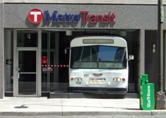
The bus and light rail system in the Twin Cities is called Metro Transit. The accompanying photo shows their name and logo, a letter T centered in a circle. This was extremely familiar to me, growing up in Massachusetts and living in Boston for many years. The Massachusetts Bay Transportation Authority, or MBTA, is called the T, and has a similar logo. In Twins county, the circle is red, and in Red Sox country, the circle is black.Having similar public transit logos helped me identified light-rail stations and bus stops. And if my memory is correct, I believe Pittsburgh has a similar logo. What if every public transit system in the US had a common symbol, similar to how most parking lots are identified by a blue background and white letter “P” by the entrance? Or in the world? It would make using public transit that much easier, as you could identify what and where it is. It is only buses and trains, how hard should it be?
Perhaps living in Chicago and learning its transit system and struggling with its inconsistent signage over the last few years had some input into this thought?
Technology • (4) Comments • Permalink
